Our colours
Introduction to colour
Colour sets the mood of brand expression.
Colour is an important factor in all visual communications.
Amongst its psychological functions, colour has a communications function to deliver a company’s message and meaning to its audience.
We want to build strong emotional connections with our stakeholders.
We can’t do this with just a logo – we need colours to cultivate these emotions.
Colour groups
Core is key
Our core colour group should be prominent in all our communications.
It consists of three colours.
- BSS Orange
- BSS Grey – Logo
- BSS Dark Grey
BSS Orange
BSS Grey – Logo
BSS Dark Grey
To reduce printing, storage, and postage we always try to produce digital documents. When we do need to print, we use Cyan, Yellow, Magenta, and Black on White Stock paper with a Light Grey background. For more information about printing please contact us through our website www.boatsafetyscheme.org.
Our core colours
Our core colour palette should be prominent in all our communications. It consists of three colours.
The following describes our Core Colour Palette and how you should use it.
BSS Orange
Used in our logo and all documents.
BSS Orange is our brand first core colour and can be used as an accent colour.
BSS Grey – Logo
Used in our logo
BSS Grey – Logo is used as our secondary core colour in our logo and you can use it as an accent colour.
BSS Dark Grey
Used as body copy colour
BSS Dark Grey is used on all communications’ copy – easier to read than black text.
What our colours represent
BSS Orange
The essence of the organisation.
It can also be used for contact.
BSS Purple
BSS Purple represents our organisation.
BSS isn’t a legal entity. It’s a collaboration established by a Memorandum of Understanding (MOU) in 1995 by its owners British Waterways (now the Canal & River Trust), and the National Rivers Authority (now the Environment Agency). The Canal & River Trust is currently the BSS’s administering body.
BSS Red
Signifies warnings and hazards.
Having safely installed systems is only part of the story. Two-thirds of fire and carbon monoxide risks arise from the way that engines, appliances, systems, and fuels are used and maintained. Information and advice on how people can keep themselves safe will be associated with this colour.
BSS Light Grey
Inclusivity.
We use BSS Light Grey as a drop shadow to highlight container/box shadows.
Containers help to break up copy making it easier to read.
BSS Blue
Represents BSS Requirements, Examinations and Certification.
There are three types of BSS Examination for private boats, hire boats, and other non-private boats.
This is the formal colour.
BSS Grey – Logo
Represents safety.
BSS Grey – Logo is used whenever “Go boating – Stay safe” is used.
It’s used to reinforce the message of “Staying Safe On The Water”.
BSS Dark Grey
Our main body copy colour.
BSS Dark Grey is used for body copy on light backgrounds – easier to read than black text.
BSS Light Blue
Safety tips.
Blue is used for top safety tips.
BSS Green
Behaviour.
Green to signify positive safe behaviour.
BSS Icon Yellow
Warnings.
Signify warning and hazards.
Our colour palette
The BSS colour range has evolved over several years to enhance our print, digital, and web presence.
Our colours are combined into complementary palettes to fit with messaging, tone, and iconography that run throughout our brand.
Colour specifications are given for:
- CMYK and Pantone references for printing.
-
RGB and Hex references for digital applications.
-
RAL for specialist reproduction.
Pantone – print
Pantone inks
You can use Pantone inks – sometimes known as pre-mixed colours – directly on the page. You can use them singly or alongside CMYK – Cyan, Magenta, Yellow, and Black.
We rarely use Pantone colours as they’re expensive to reproduce. We list them as they’re the parent colours of all our CMYK colour palette.
BSS Orange
Pantone
PMS 021 C
BSS Purple
Pantone
PMS 2617 C
BSS Red
Pantone
PMS 485 C
BSS Light Grey
Pantone
PMS Cool Gray 2 C
BSS Blue
Pantone
PMS 286 C
BSS Grey – Logo
Pantone
PMS Cool Gray 8 C
BSS Dark Grey
Pantone
PMS 419 C
BSS Light Blue
Pantone
PMS 2935 C
BSS Green
Pantone
PMS 355 C
BSS Icon Yellow
Pantone
Process Yellow C
Printed colours vary from their on-screen digital equivalents and can be affected by the material they’re printed onto.
You should use Pantone colours for lithographic printing.
CMYK – print
CMYK
CMYK stands for Cyan, Magenta, Yellow and Black. We’ve matched our CMYK colours to Pantone as accurately as possible.
BSS Orange
CMYK
8% 70% 100% 1%
BSS Purple
CMYK
85% 100% 0% 23%
BSS Red
CMYK
0% 97% 100% 0%
BSS Light Grey
CMYK
14% 10% 8% 0%
BSS Blue
CMYK
100% 80% 0%12%
BSS Grey – Logo
CMYK
4% 1% 0% 45%
BSS Dark Grey
CMYK
6% 0% 3% 86%
BSS Light Blue
CMYK
100% 46% 0% 0%
BSS Green
CMYK
94% 0% 100% 0%
BSS Icon Yellow
CMYK
0% 0% 100% 0%
Printed colours vary from their on-screen digital equivalents and can be affected by the material they’re printed onto.
CMYK should be used for Lithographic printing.
RGB – digital
RGB
RGB stands for Red, Green, and Blue – the three hues of light that can be mixed together to create different colours for digital applications.
BSS Orange
rgb
225, 107, 2
BSS Purple
rgb
77, 33, 109
BSS Red
rgb
238, 50, 36
BSS Light Grey
rgb
08, 209, 201
BSS Blue
rgb
36, 70, 142
BSS Grey – Logo
rgb
136, 139, 141
BSS Dark Grey
rgb
33, 35, 34
BSS Light Blue
rgb
0, 118, 191
BSS Green
rgb
0, 169, 79
BSS Icon Yellow
rgb
255, 238, 0
Printed colours vary from their on-screen digital equivalents and can be affected by the material they’re printed onto. You should use RGB and / or CMYK for digital printing – check with your printer.
Web colours and font specifications
H1: Font size 30px | Line height 1.4em
H2 and H3: Font size 25px | Line height 1.3em
H4 and H5: Font size 20px | Line height 1.3em
Container background BSS Orange #e16b02 – use as solid. Font colour on background #ffe9c4 – use as solid.
H1 example
30px on 1.4em Line height
Lato Black
Container background BSS Purple #4b216d – use as solid. Font colour on background #f6f5f7 – use as solid.
H1 example
30px on 1.4em Line height
Lato Black
Container background BSS Light Grey #d0d0c9 – use as solid. Font colour on background #212322 – use as solid.
H1 example
30px on 1.4em Line height
Lato Black
Container background BSS Blue #24468e – use as solid. Font colour on background #f6f5f7 – use as solid.
H1 example
30px on 1.4em Line height
Lato Black
Container background BSS Grey – Logo #888b8d – use as solid. Font colour on background #f6f5f7 – use as solid.
H1 example
30px on 1.4em Line height
Lato Black
Container background BSS Dark Grey #21233 – use as solid. Font colour on background #f6f5f7 – use as solid.
H1 example
30px on 1.4em Line height
Lato Black
Container background BSS Light Blue #0076bf – use as solid. Font colour on background #f6f5f7 – use as solid.
H1 example
30px on 1.4em Line height
Lato Black
Container background BSS Green #00a94f – use as solid. Font colour on background #f6f5f7 – use as solid.
H1 example
30px on 1.4em Line height
Lato Black
Container background BSS Red #ee2a24 – use as solid. Font colour on background #fbf2e9 – use as solid.
H1 example
30px on 1.4em Line height
Lato Black
Container background BSS Icon Yellow #fff200 – use as solid. Font colour on background #21233 – use as solid.
H1 example
30px on 1.4em Line height
Lato Black
HEX – digital
HEX / #
Designers and developers use a HEX colour value to specify colour on the web.
BSS Orange
hex
#e16b02
BSS Purple
hex
#4b216d
BSS Red
hex
#ee2a24
BSS Light Grey
hex
#d0d1C9
BSS Blue
hex
#24468e
BSS Grey – Logo
hex
#888b8d
BSS Dark Grey
hex
#212322
BSS Light Blue
hex
#0076bf
BSS Green
hex
#00a94f
BSS Icon Yellow
hex
#fff200
You shouldn’t use Hex colours for printing.
Specialised reproduction
RAL colours
RAL is a European colour matching system used to specify colours for paint, coatings, and plastics.
BSS Orange
RAL Classic
2004
BSS Purple
RAL Classic
4007
BSS Red
RAL Classic
3020
BSS Light Grey
RAL Classic
7004
BSS Blue
RAL Classic
5022
BSS Grey – Logo
RAL Classic
7012
BSS Dark Grey
RAL Classic
7021
BSS Light Blue
RAL Classic
5017
BSS Green
RAL Classic
6037
BSS Icon Yellow
RAL Classic
1026
Printed colours will vary from their on-screen digital equivalents and may also be affected by the material they’re printed onto. Where possible use colours as close as you can to the original Pantone specification when utilising the Ral colour system.
Safety communications using the ISO standards for safety
We sometimes need safety signs. For these, you should use ISO 1070 Safety Sign Colours based on ISO 3864.
Please follow the colour chart when specifying ISO standard signage print.
These are the colours specified in ISO Standard 3864-4:2011 in RAL colour standard.
Warning
Signal Yellow | Ral 1003
RGB/Hex #F9A800
Safe Condition
Signal Green | Ral 1003
RGB/Hex #237F52
Prohibition / Fire Equipment
Signal Red | Ral 3001
RGB/Hex #9B2423
Backgrounds and Symbol
Signal White | Ral 1003
RGB/Hex #ECECE7
Mandatory
Signal Blue | Ral 5005
RGB/Hex #005387
Symbol
Signal Black | Ral 1003
RGB/Hex #2B2B2C
In addition, ISO standard 3864-2:2016 lays out the following colours that correspond to levels of risk.[4] This standard adds “Orange” as an incremental colour to the palette in Section 3.4.
Low level of risk
Panel background: Yellow
Contrast colour: Black
Definition: RAL 1003 (per ISO 3864-4)
RGB/Hex: #F9A800
Medium level of risk
Panel background: Orange
Contrast colour: Black
Definition: RAL 2010, Munsell, 2,5YR6/14G, or Munsell 5YR6/15G
RGB/Hex: #D05D29
High level of risk
Panel background: Red
Contrast colour: White
Definition: RAL 3001 (per ISO 3864-4)
RGB/Hex: #9B2423
Printed colours will vary from their on-screen digital equivalents and may also be affected by the material they’re printed onto. Where possible use colours as close as you can to the original Pantone specification when utilising the Ral colour system.
Printing
Three common commercial print processes
When we require printing, we use three methods – each with their own merits and qualities.
Not all print methods suit every
print requirement.
Printed colours will vary from their on-screen digital equivalents and may also be affected by the material they’re printed onto.
Please discuss all types of print provision with the BSS before printing.
Lithographic Print
This process creates an image by using a plate coated with water and ink to carry both the image and non-image areas. The ink (and therefore the image) is then transferred onto the substrate using pressure.
Lithographic printing can use CMYK inks and Pantone inks. Sometimes, special coatings can also be applied using this process.
From a cost perspective lithographic printing tends to be most cost effective when printing large runs.
We’d usually expect lithographic printing to be used for brochures and fliers.
Digital Print
Digital printing prints from a digital-based image directly to a variety
of media.
It’s normally used for small-runs.
You can use digital printing for a variety of products such as:
- Large format.
- High volume laser.
- Short run stationery and business cards.
- Banners.
- High quality proofing.
- Vehicle graphics.
Screen Print
This technique creates a picture or pattern by forcing ink onto a surface through a screen of fine material.
You can use screen printing for a variety of products such as:
- Merchandise.
- Special surfaces where lithographic or digital printing isn’t suitable.
Accessibility
Fonts on backgrounds
Various factors affect accessibility. Always consider font size, colour, contrast, and legibility.
Solid backgrounds can be useful to break up large areas of copy, making the page more legible.
- Please remember:
Avoid using coloured or white type on coloured backgrounds at small sizes. - When using colour headings ensure colour backgrounds are a flat solid if possible.
- Make sure type is legible.
- Consider size, weight, and contrast.
- Don’t use black or white text.
BSS Orange
You shouldn’t use black or white as a font colour.
When using text on a BSS Orange background use 7% BSS Orange.
BSS Light Grey
You shouldn’t use black or white as a font colour.
When using text on a BSS Light Grey background use 100% BSS Dark Grey.
BSS Dark Gray
Don’t use black or white as a font colour.
When showing text on a BSS Dark Grey background use 7% BSS Dark Grey
BSS Yellow
Don’t use black or white as a font colour.
When showing text on Icon Yellow use 100% BSS Dark Grey.
BSS Purple
You shouldn’t use black or white as a font colour.
When using text on a BSS Purple background use 7% BSS Purple.
BSS Blue
You shouldn’t use black or white as a font colour.
When using text on a BSS Blue background use 7% BSS Blue.
BSS Light Blue
Don’t use black or white as a font colour.
When showing text on a BSS Light Blue background use 7% BSS Light Blue.
BSS Red
You shouldn’t use black or white as a font colour.
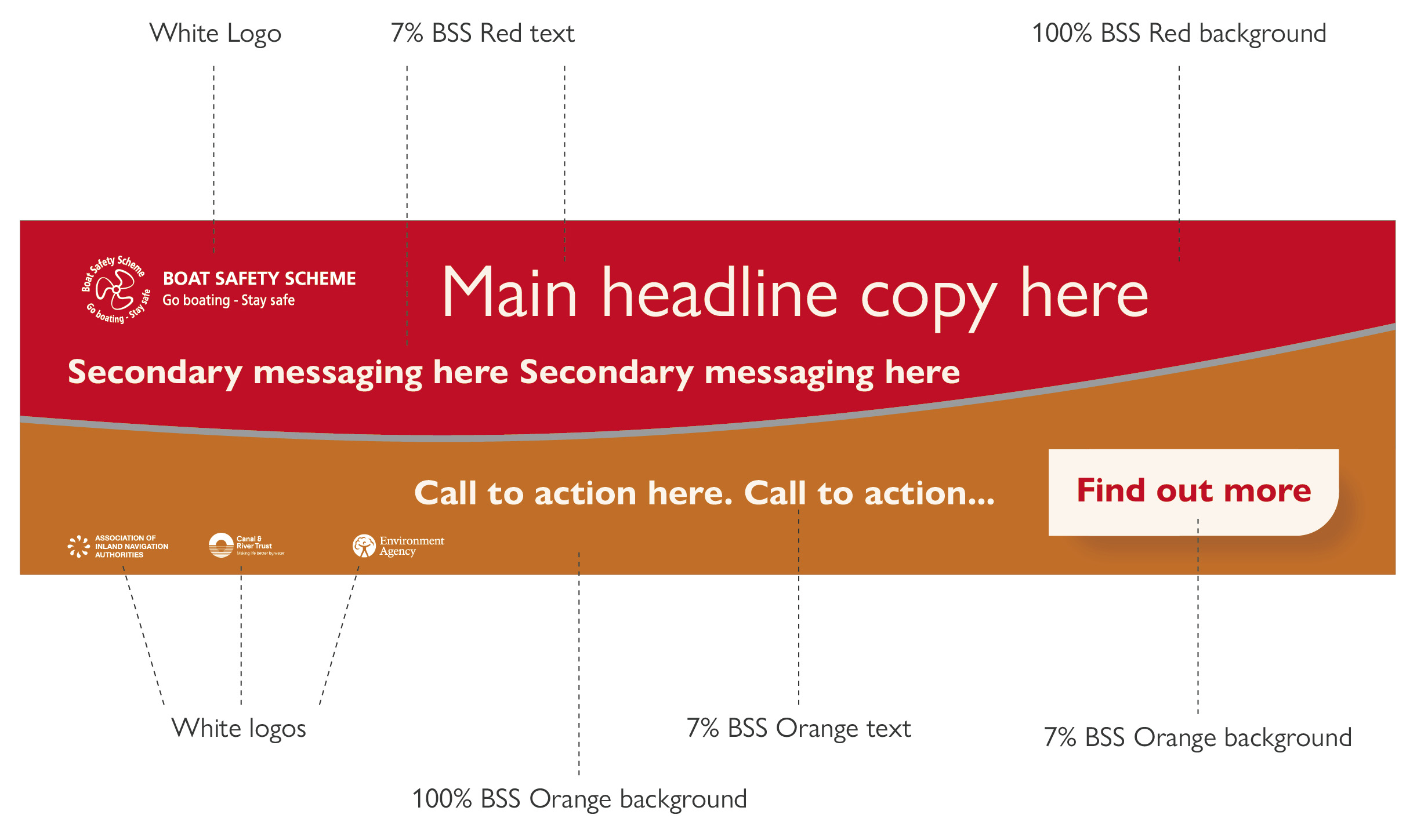
When using text on a BSS Red background use 7% BSS Red.
BSS Grey – Logo
You shouldn’t use black or white as a font colour.
When showing text on BSS Grey Logo background use 7% BSS Grey Logo.
BSS Green
Don’t use black or white as a font colour.
When showing text on a BSS Green background use 7% BSS Green.
Accessibility
Colour and graphical elements
In all designs please follow these simple rules:
-
Never use white text. Always use a tint of the background colour to colour the text, or you can use BSS Dark Grey on light-coloured backgrounds. See Sections 3.8 and 3.81 for more details.
Colour sets/pairings:
-
In this example the BSS Red background signifies warnings and hazards and should only be paired with white or BSS Orange. See 3.2 – 3.4.1 for colour representation.
Our core colour palette should be prominent in all our communications. It consists of three colours.
- BSS Orange
- BSS Grey – Logo
- BSS Dark Grey
Accessibility
Photographic backgrounds
In all designs please follow these simple rules:
-
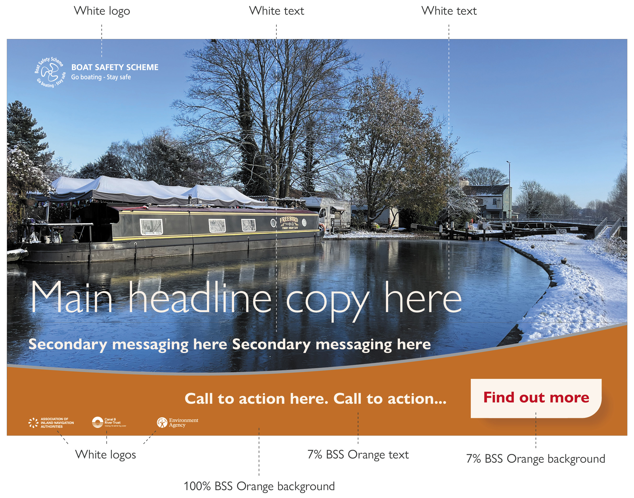
You may use white text on photographic backgrounds.
-
On occasions when the photograph is very light then use BSS Dark Grey for your font colouring.
Colour sets/pairings:
-
In this example the BSS Orange is used as the Core colour and paired with an approved BSS photograph.
Our core colour palette should be prominent in all our communications. It consists of three colours.
- BSS Orange
- BSS Grey – Logo
- BSS Dark Grey
Use of tints
CMYK tints
Using tints gives a broader
spectrum of colours to choose from.
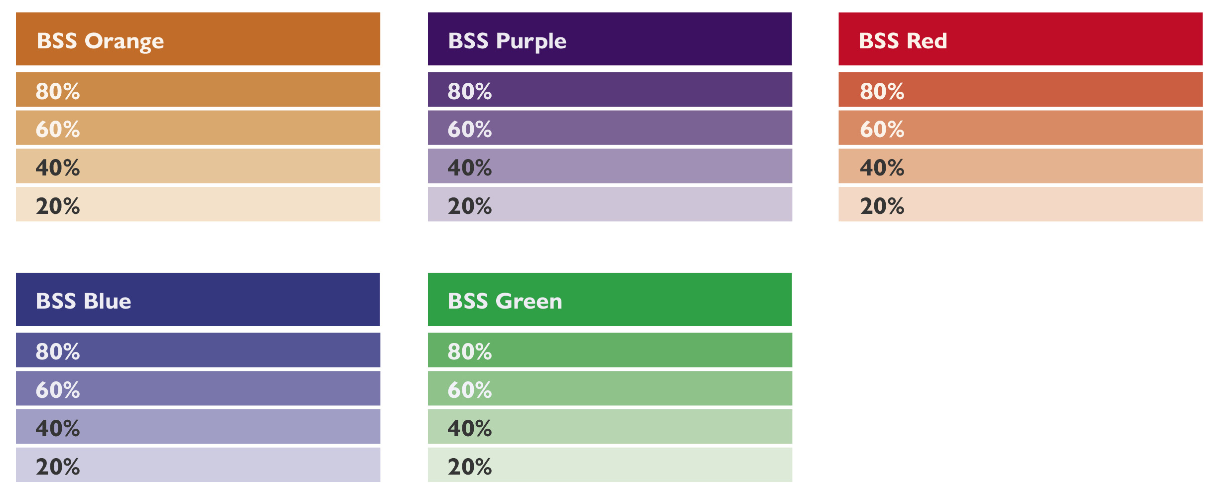
As rule of thumb use a solid
BSS Dark Grey coloured font on tints below 60% and a 7% tint of the solid background colour when a background is above 60% tint.
Colour combinations
Combining colour
You should use colour combinations and tints in conjunction with what, or who, they represent. See Section 3.2 for representation.
You can use BSS Orange as a stand-alone colour to represent the brand.
Colour combinations:
- In these examples you can see how the BSS three Core colours have been paired with other BSS colours to create combinations where the non core colour represents a subject with support from the BSS Core colour sets. See 3.2 – 3.4.1 for colour representation.
Our core colour palette should be prominent in all our communications. It consists of three colours.
- BSS Orange
- BSS Grey – Logo
- BSS Dark Grey
BSS Orange
BSS Grey Logo
BSS Dark Gray
BSS Orange
BSS Purple
BSS Grey Logo
BSS Dark Gray
BSS Orange
BSS Red
BSS Grey Logo
BSS Dark Gray
BSS Orange
BSS Blue
BSS Grey Logo
BSS Dark Gray
BSS Orange
BSS Blue
BSS Grey Logo
BSS Dark Gray
Usage rules
General guidance
You should always include BSS Orange in your design. This can be simply by using our core BSS logo.
Number of colours
Use no more than one colour combination per communication (three colours in total including the grey highlight curve).
Using colour in the BSS Curves
BSS Curves are created using two corresponding colours – one rich and one bright (only use tints if they enhance your design). Select colours which represent your subject as per Section 3.2 – 3.4.1.
Selecting colours
Choose colours to complement your photography.

BSS Core Orange (main subject) with BSS Light Blue (safety tips – secondary messaging).

BSS Grey Logo (main subject – safety) with BSS Core Orange.

BSS Core Orange (subject BSS generic messaging) with white.
BSS Icon Yellow (main subject – warnings) with BSS Core Orange.

BSS Light Blue (main subject – safety tips). Core colour pairing through BSS logo.

BSS Green (main subject – behaviour) with BSS Core Orange.

BSS Blue (main subject – BSS requirements, examinations and certification) with BSS Core Orange.

BSS Core Orange (main subject) with BSS Green (behaviour – secondary messaging).

BSS Light Blue (main subject – safety tips) with BSS Core Orange.
Examples of use
Combinations
These examples show how you can use our colour combinations for print and digital applications including web using appropriate digital or web colour palates.
You should only use colours specified in this guide.

BSS Yellow (main subject – warnings) with BSS Light Blue (safety tips – secondary messaging). Core colour pairing through BSS logo.

BSS Grey Logo (main subject – safety) with BSS Blue (BSS requirements). Core colour pairing through BSS logo.

BSS Green (main subject – behaviour). Core colour pairing through BSS logo.

BSS Grey Logo (main subject – safety) with BSS Green (behaviour – secondary messaging). Core colour pairing through BSS logo.

BSS Purple (main subject – BSS organisation) with BSS Core Orange.
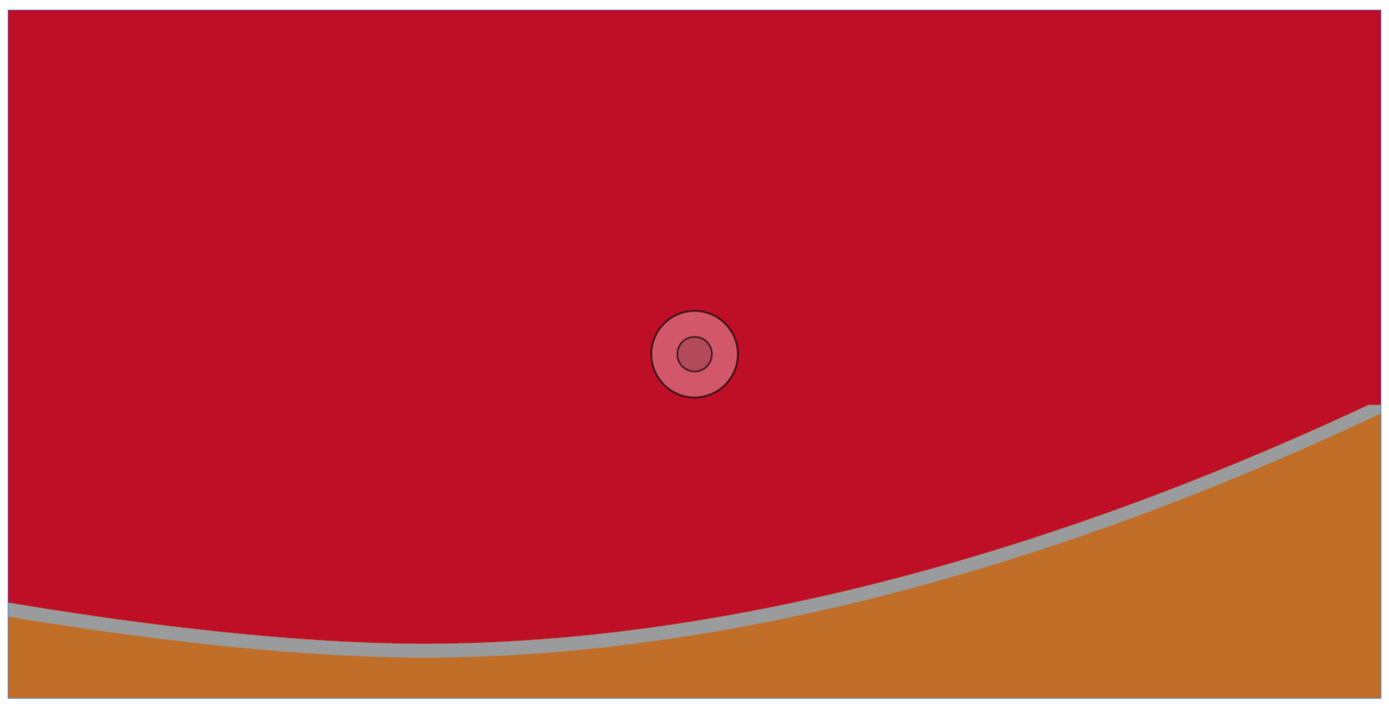
BSS Red (main subject – warnings and hazards) with BSS Core Orange.

BSS Purple (main subject – BSS organisation). Core colour pairing through BSS logo.

BSS Red (main subject – warnings and hazards) with BSS Blue (BSS requirements – secondary messaging). Core colour pairing through BSS logo.

BSS Light Blue (main subject – safety tips) with BSS Blue (BSS requirements – secondary messaging). Core colour pairing through BSS logo.
For advice on applying the BSS’s brand and design guidelines, please contact us through our website www.boatsafetyscheme.org or call: 0333 202 1000.
All diagrams, illustrations, and images aren’t to scale and are for illustrative purposes only.
