Fire Kills identity guidelines
Published February 2008
Published February 2008 – Colour palette updated January 2023
We want to communicate as effectively as we can with the public to protect them from the risk of fire. These guidelines will help you to create communications materials that are striking, clear, consistent and accessible to a wide range of audiences.
Visual representations of Fire Kills make a strong impression and consistency is vital if we are to deliver memorable communications, convey an authoritative professional image and build our reputation.
A consistent identity will make sure people recognise Fire Kills and remember the important information we deliver.
What is Fire Kills?
- Fire Kills is a publicity campaign that promotes important messages concerning fire safety.
- Fire Kills is run by the Department of Communities and Local Government to support the work of Fire and Rescue Services at a local level.
- The programme comprises three core community fire safety themes: prevention, detection and escape, with the primary message focused on smoke alarm ownership and maintenance.
- The campaign is made up of different forms of communications, including via broadcast media (television and radio), online, and via PR and printed communications. An overarching brand look and feel is used across all communications materials to ensure consistency.
- The Fire Kills campaign promotes important messages concerning fire safety and is used by Government and Fire Services and sponsorship partners across
the UK.
Why is branding important?
Imagine the BBC logo with a missing ‘B’. The NHS logo in pink or the Police Force identity in orange. Consistency can lead to greater recognition and respect.
A brand identity with a high degree of order and regularity will help all Fire and Rescue Services promote clear, concise and accessible information.
We all need to follow these guidelines to promote and protect the Fire Kills brand identity. We can only do it with your help, but we do need rules. We hope that you will see these guidelines as a positive contribution, a tool kit to help make our brand strong.
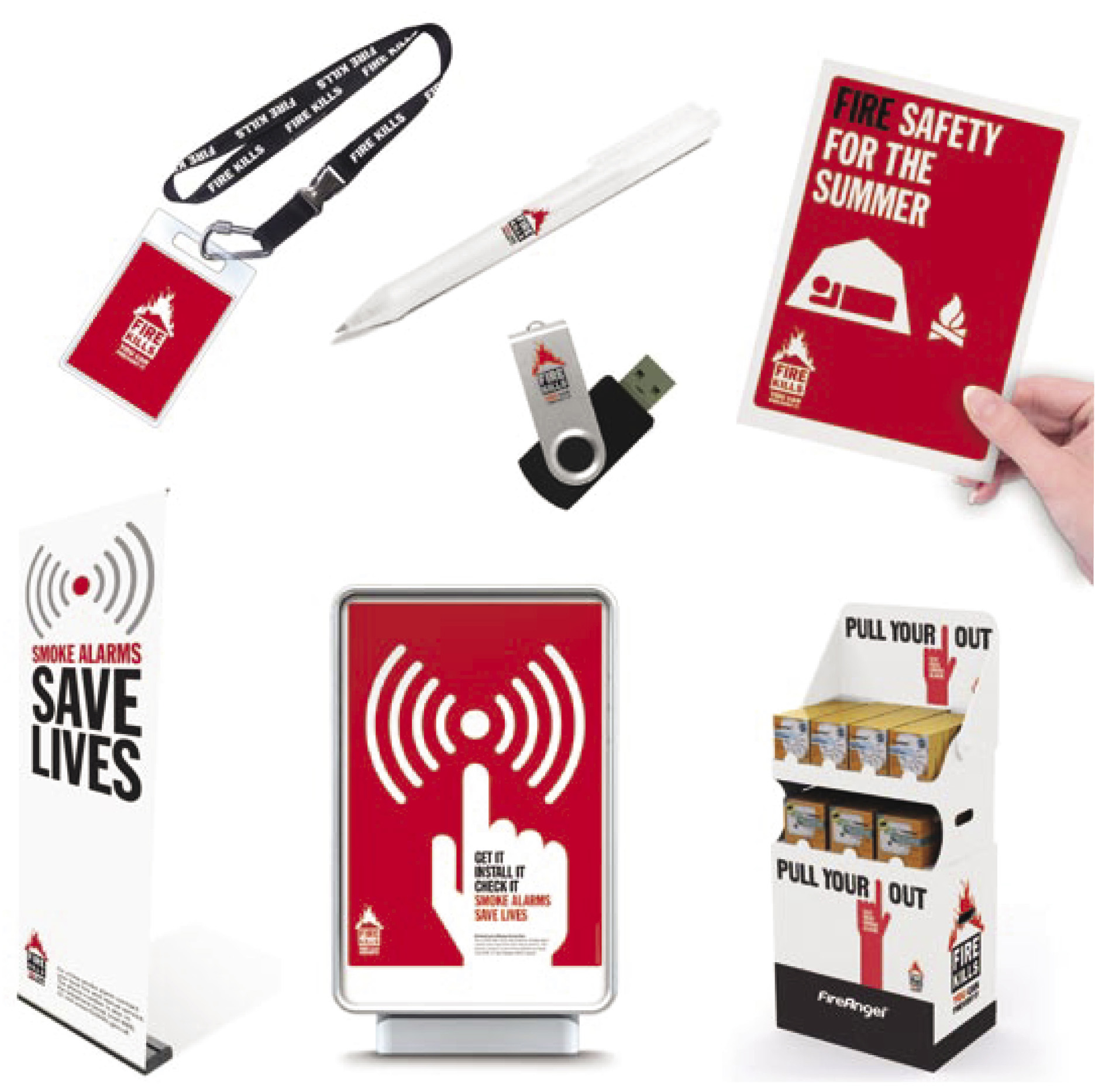
To support these guidelines, a CD tool kit is provided containing logo artworks as well as a wide range of illustrations.
Overview of the brand
A brand is much more than just a logo. Shapes, colours, photography and typography all have an important role to play. Put together effectively they can communicate a unique personality and memorable look and feel.
We’ve created a complete identity system to bring our communications to life and make them impossible to ignore. Used consistently, our brand identity will help us to communicate effective fire safety messages that leave the right impact.
Using the logo correctly
Here is our logo. The logo is at the heart of our brand identity and is a valuable asset. We must therefore take care to protect it and use it correctly. Using the logo in a consistent format will ensure it retains its impact.
The logo should only be used in the colour variations shown on this page:
- In black and red on a plain white background.
- In black on a plain white background.
- In white on a black or red background.
- In white on another colour in the Fire Kills palette.
Always ensure there is good contrast for reproducing the logo.
Additional copies of the artwork CD are available from the Fire Kills marketing team:
7th Floor
Eland House
Bressenden Place
London
SW1E 5DU
T 020 7944 3628
Using the approved artwork will help avoid incorrect usage.
Primary red
CMYK = 21 100 100 14
Black
Pantone Process Black C
C0/M0/Y0/K100
R0/G0/B0
HEX 00 00 00
Full colour
One colour
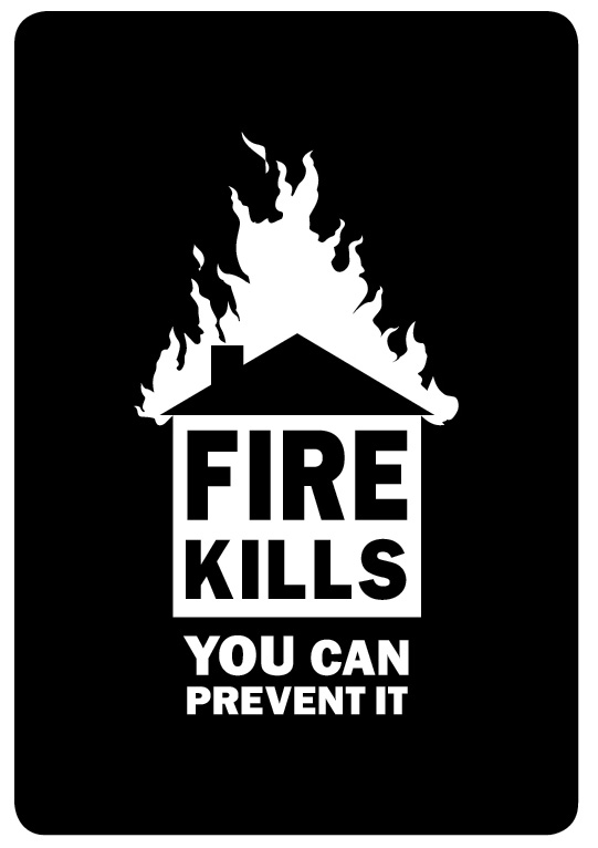
One colour reversed out of black background
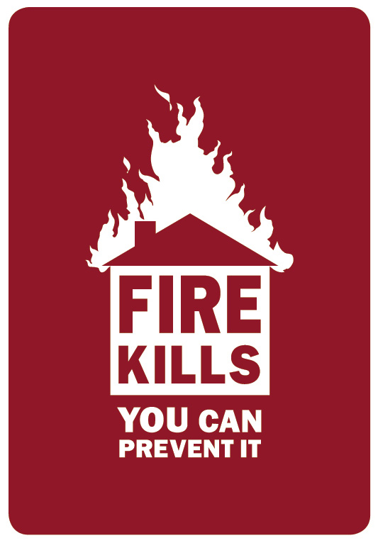
One colour reversed out of red background
Minimum logo size and exclusion zone
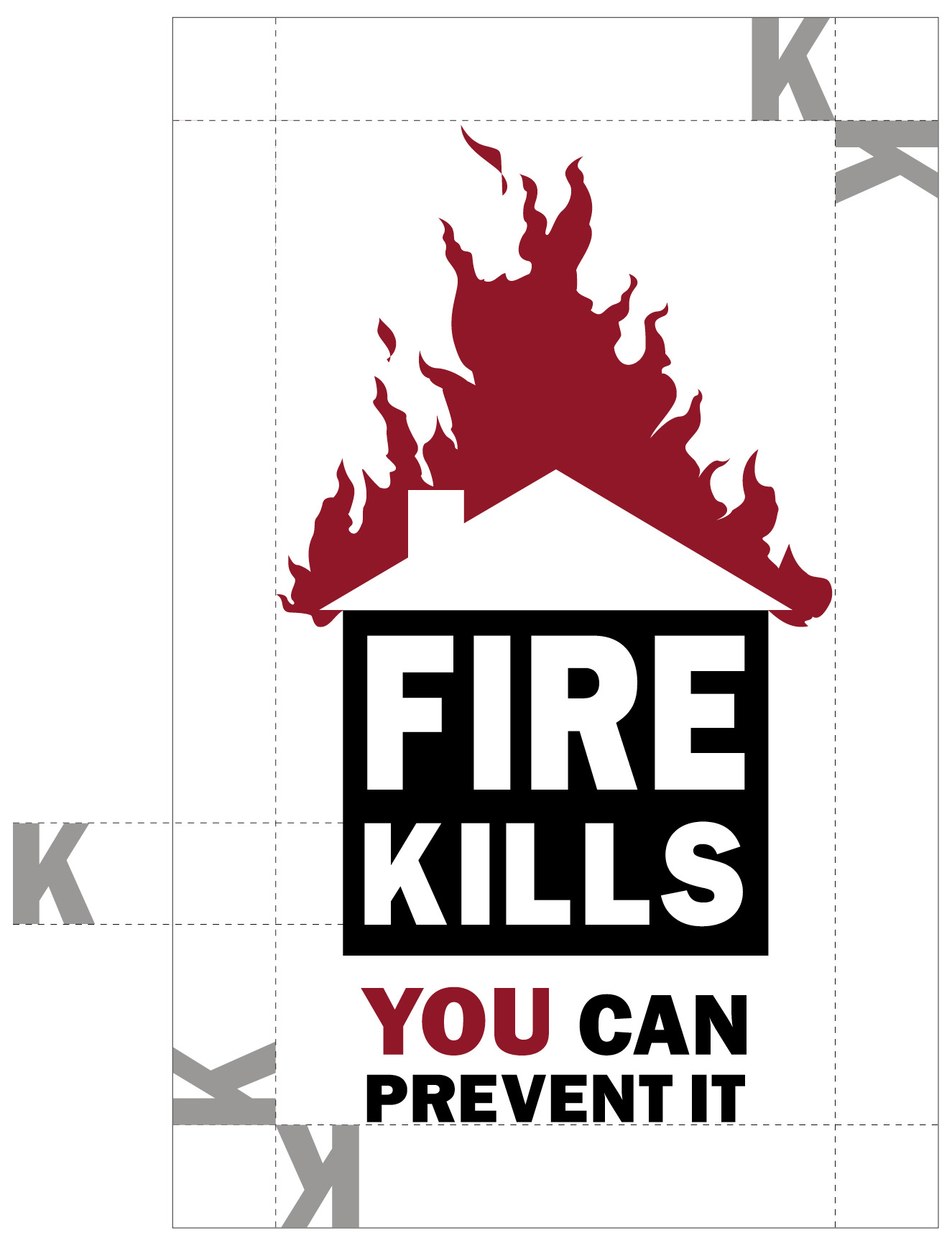
The clear space around the logo is known as the exclusion zone. It makes sure the logo is prominent and can be seen clearly whenever it appears. The recommended exclusion zone is based on the height of the ‘K’ in ‘Kills’. No other elements must appear in this clear space on all four sides of the logo.
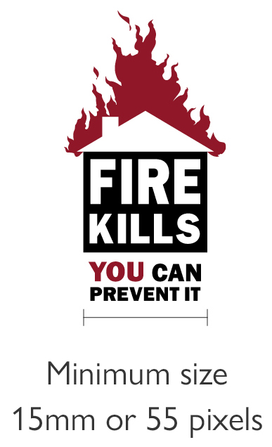
We want to make sure our logo can always be read properly. That’s why we have a recommended minimum logo size of 15mm or 55 pixels wide. Please avoid using the logo any smaller.
There may be exceptional circumstances where the logo may need to be used in smaller than the minimum size, like on merchandise such as pens. Please use the logo at 15mm or larger whenever you can.
Positioning the logo
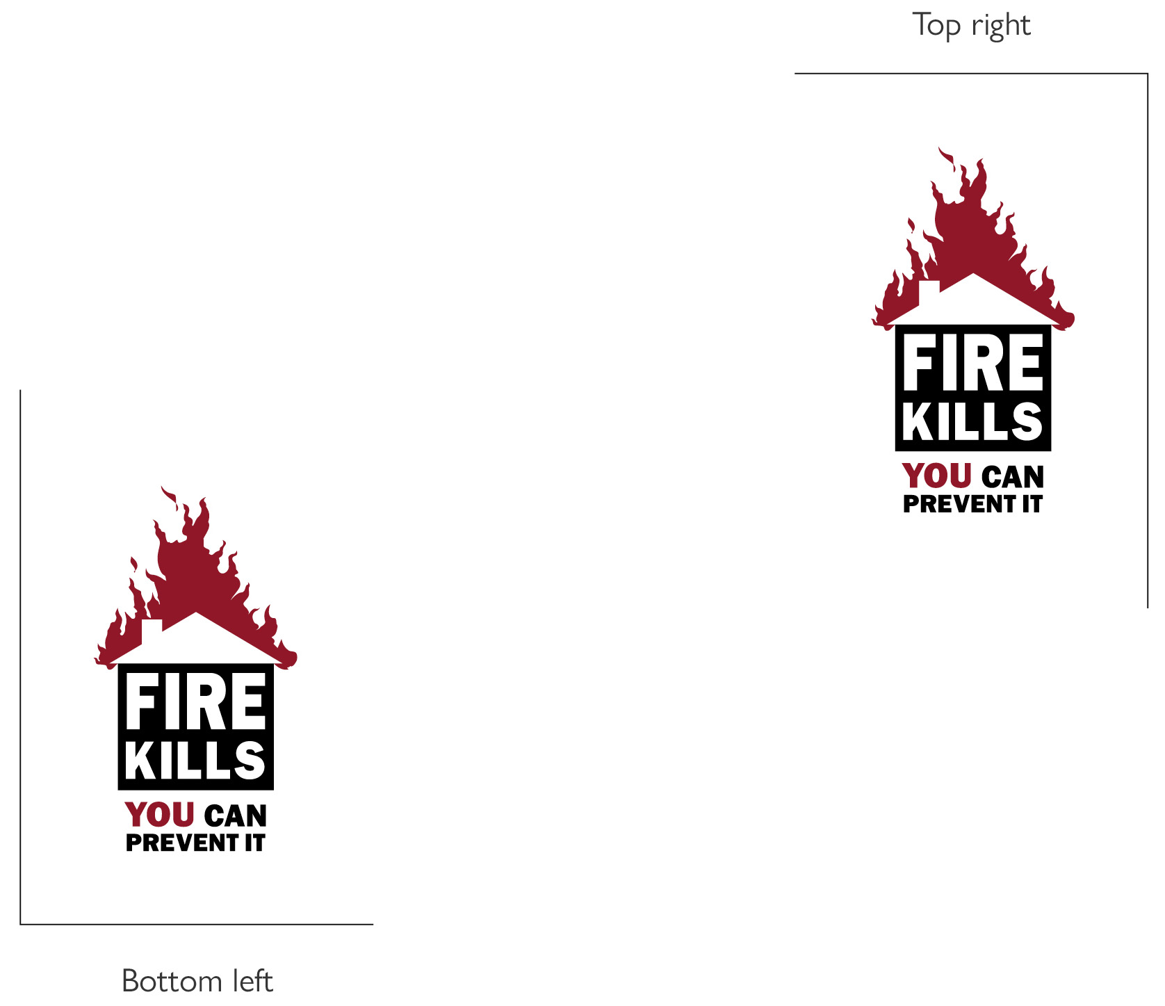
Positioning the logo consistently will ensure that it always stands out. The preferred logo positioning is in the bottom left hand corner of the page. The logo can also be used in the top right hand corner when necessary.
On rare occasions it may be necessary to centre the use of the logo, on merchandise like bags for example. However, please try to stick to our preferred positioning in the bottom left hand corner as much as you can.
Working with partners
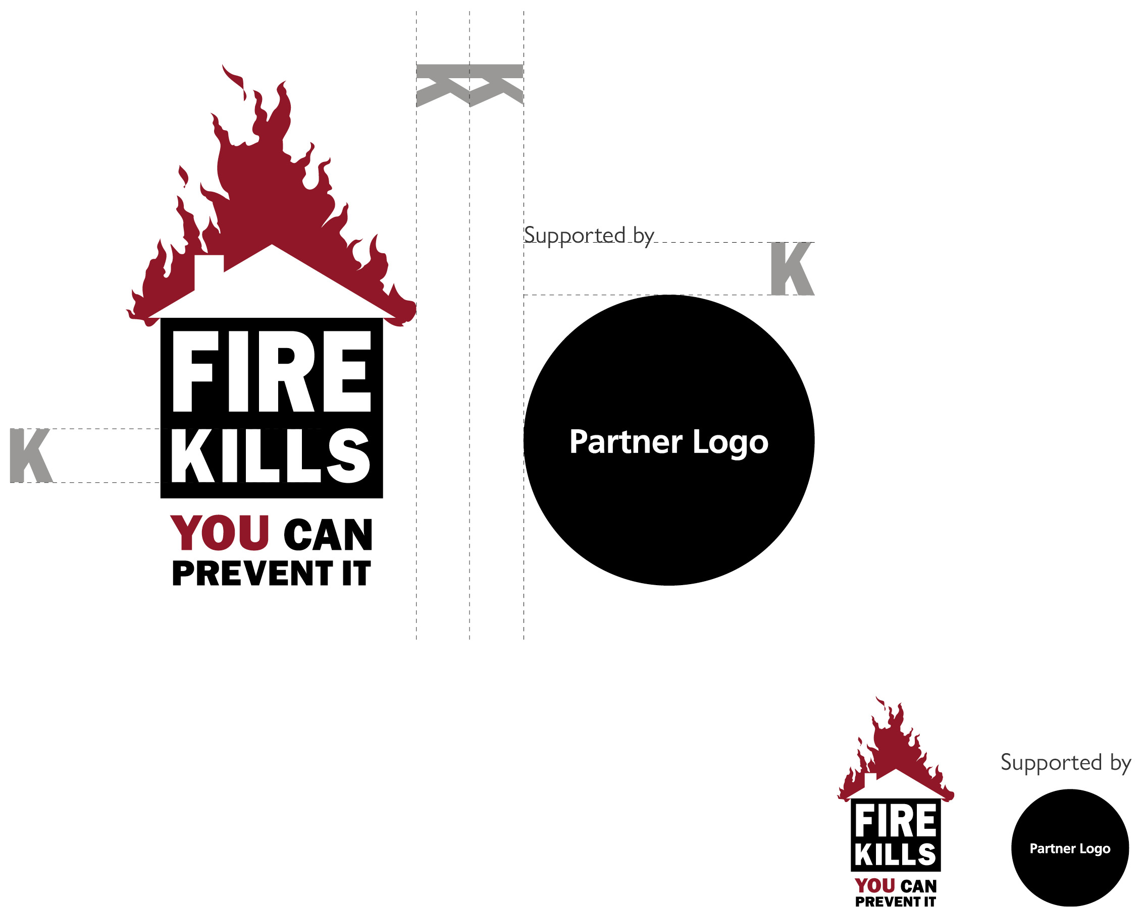
To associate Fire Kills with partner organisations place the Fire Kills logo and the partner logo alongside each other in a landscape format. Wherever possible place the Fire Kills logo first, especially when Fire Kills is the leading partner. Always make sure there is a minimum exclusion zone (K+K) between the two logos.
Please ensure you explain the relationship between Fire Kills and the partner organisation. You can do this with a few small words such as ‘supported by’ above the partner logo in Frutiger 55 Roman.
Refer to the partner organisations’ identity guidelines to ensure you use their logo correctly.
Please make sure that the Fire Kills logo is reproduced at 15mm width or more.
Working with Fire Services
The Fire Kills identity is frequently used by Fire Services to support their fire prevention and education work. Using the identity consistently will help all Fire and Rescue Services present a strong message.
The Fire Kills logo should only be used for campaign materials aimed at the general public, raising awareness of the three core community fire safety themes of prevention, detection and escape.
The logo should not be used for internal purposes, for reports or recruitment. If the piece of communication is aimed at the public and the content is focused on fire safety messages you should use a Fire Safety logo.
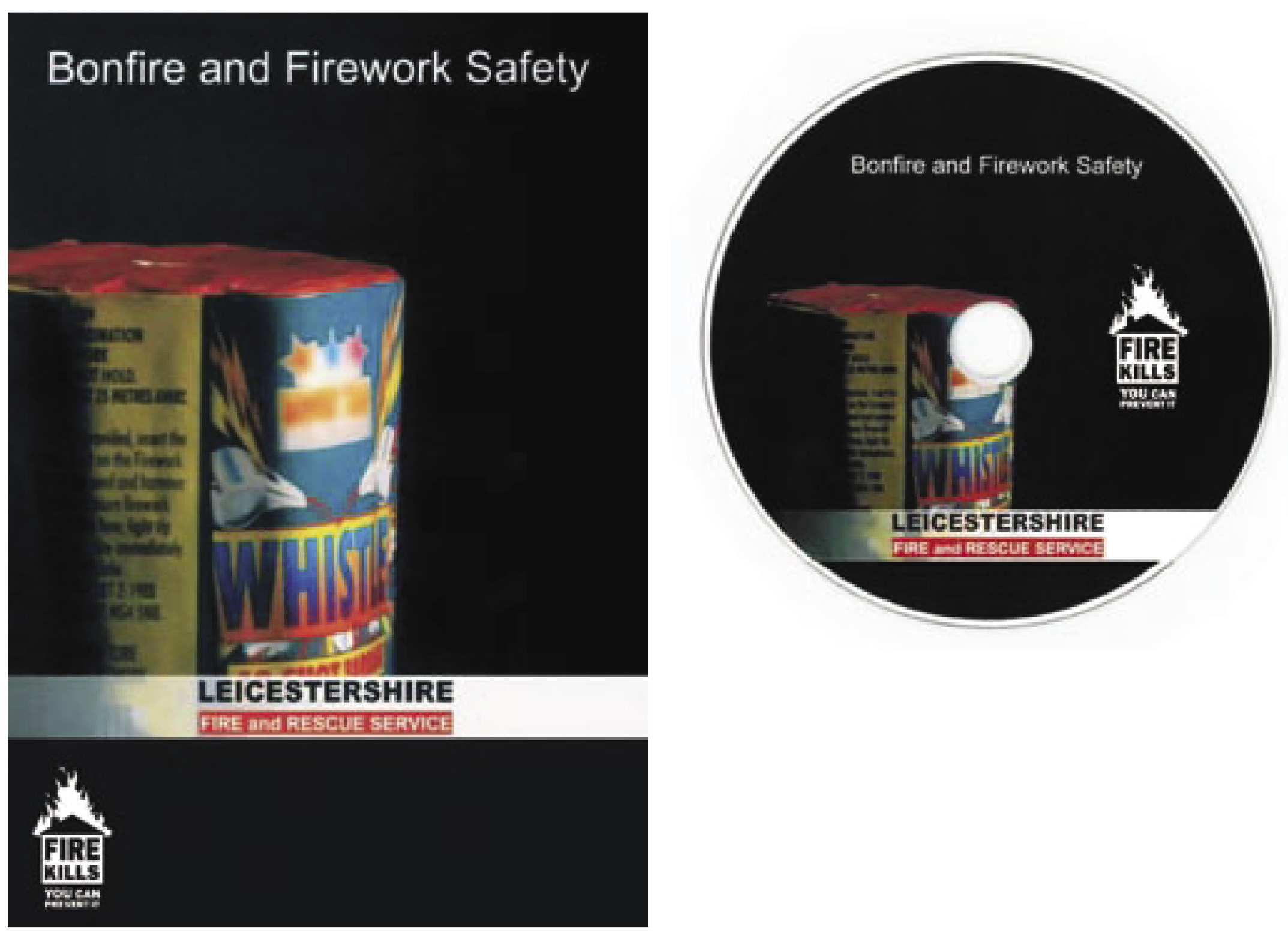
When the Fire Kills logo is used alongside Fire Services own logos, we recommend using the Fire Kills logo n the bottom left hand corner of a front or back page as shown here.
Incorrect use of the logo
Illustrated on this page are a few common mistakes people make when using the Fire Kills logo.
Artwork for the logo is available from the Fire Kills marketing team:
7th Floor
Eland House
Bressenden Place
London
SW1E 5DU
T 020 7944 3628
Using the approved artwork will help avoid incorrect usage.
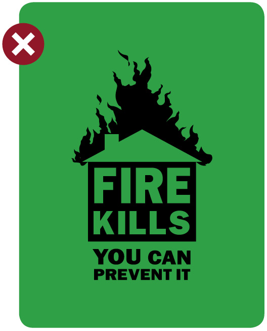
Don’t place the single colour black logo over a colour background
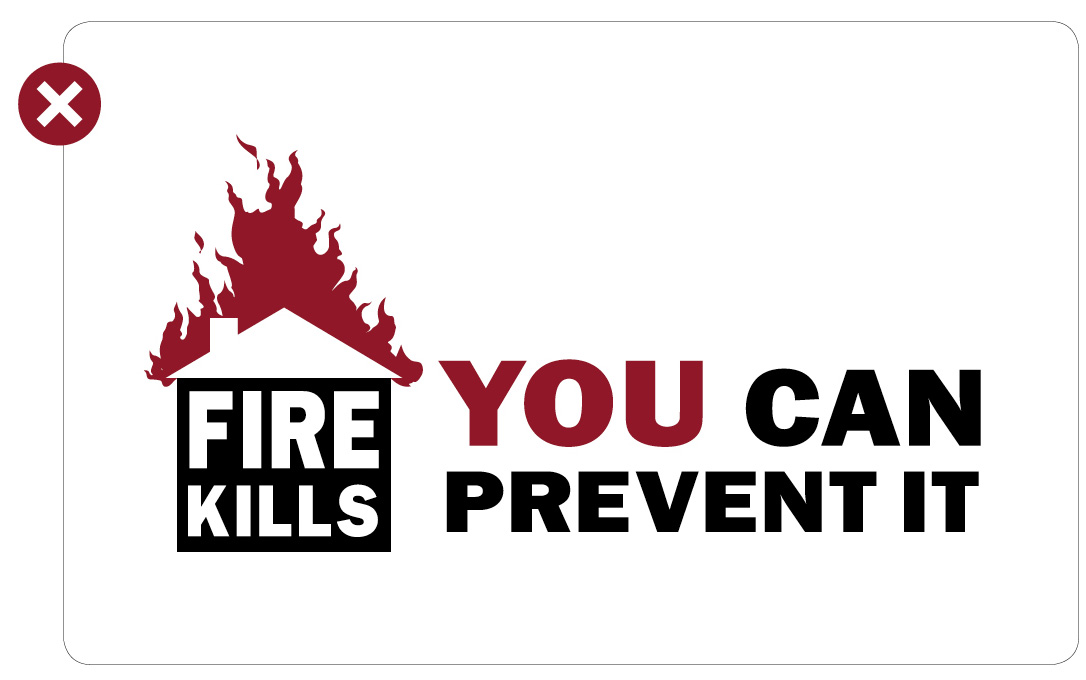
Don’t alter the logo in anyway
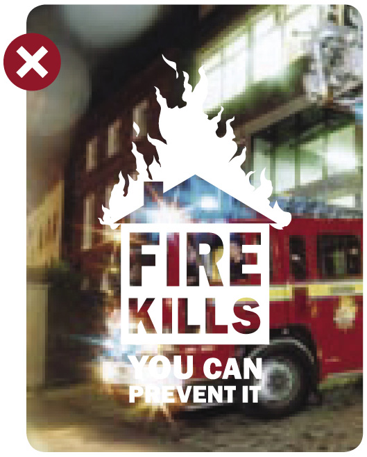
Don’t place the logo over a photo
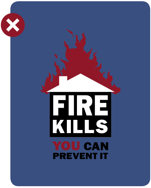
Don’t place the colour logo over a colour background
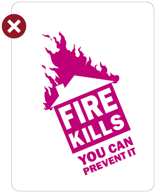
Don’t re-colour or rotate the logo
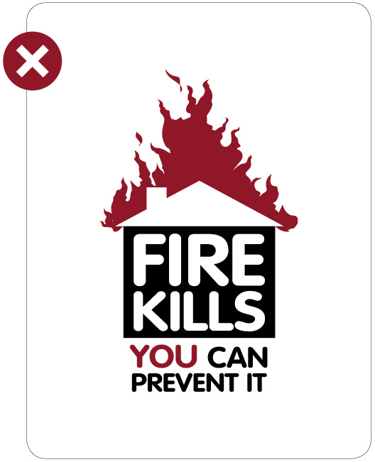
Don’t substitute logo text with another font
Colours
The Fire Kills identity is built upon a restricted number of primary colours to make sure our communications are always vibrant, clear and consistent. Using a restricted number of colours ensures we maintain a strong impact.
Only the colours shown on this page should be used.
We also use our colours to help readers navigate our communications and identify different types of information. Red and yellow signify warnings and hazards, and are used to highlight advice which informs people of things they should avoid in order to prevent a fire. Blue is used for top safety tips and green is used to signify positive safe behaviour. Black and grey provide a neutral contrast and are predominately used for copy.
Primary Red
C21/M100/Y100/K14
Primary Green
C94/M0/Y100/K0
Primary Blue
C99/M66/Y23/K6
Grey
Pantone Cool Gray 9 C
C0/M1/Y0/K51
R145/G145/B148
HEX 91 91 95
Yellow
Pantone Process Yellow C
C0/M0/Y100/K0
R255/G238/B0
HEX FF F2 00
Black
Pantone Process Black C
C0/M0/Y0/K100
R0/G0/B0
HEX 00 00 00
Typography
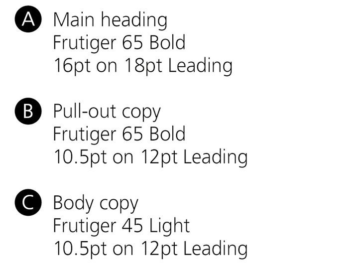
We have two typefaces. Our primary font is Frutiger, which should be used for all body copy.
Three weights can be used to help highlight different layers of information:
- Frutiger 45 Light
- Frutiger 55 Roman
- Frutiger 65 Bold
The recommended minimum size for body copy is 10.5pt.
ABCDEFGHIJKLMN OPQRSTUVWXYK
abcdefghijklmnop qrstuvwxyk1234567
890!@£$%^&*()
Arial should be used for all on-screen applications.
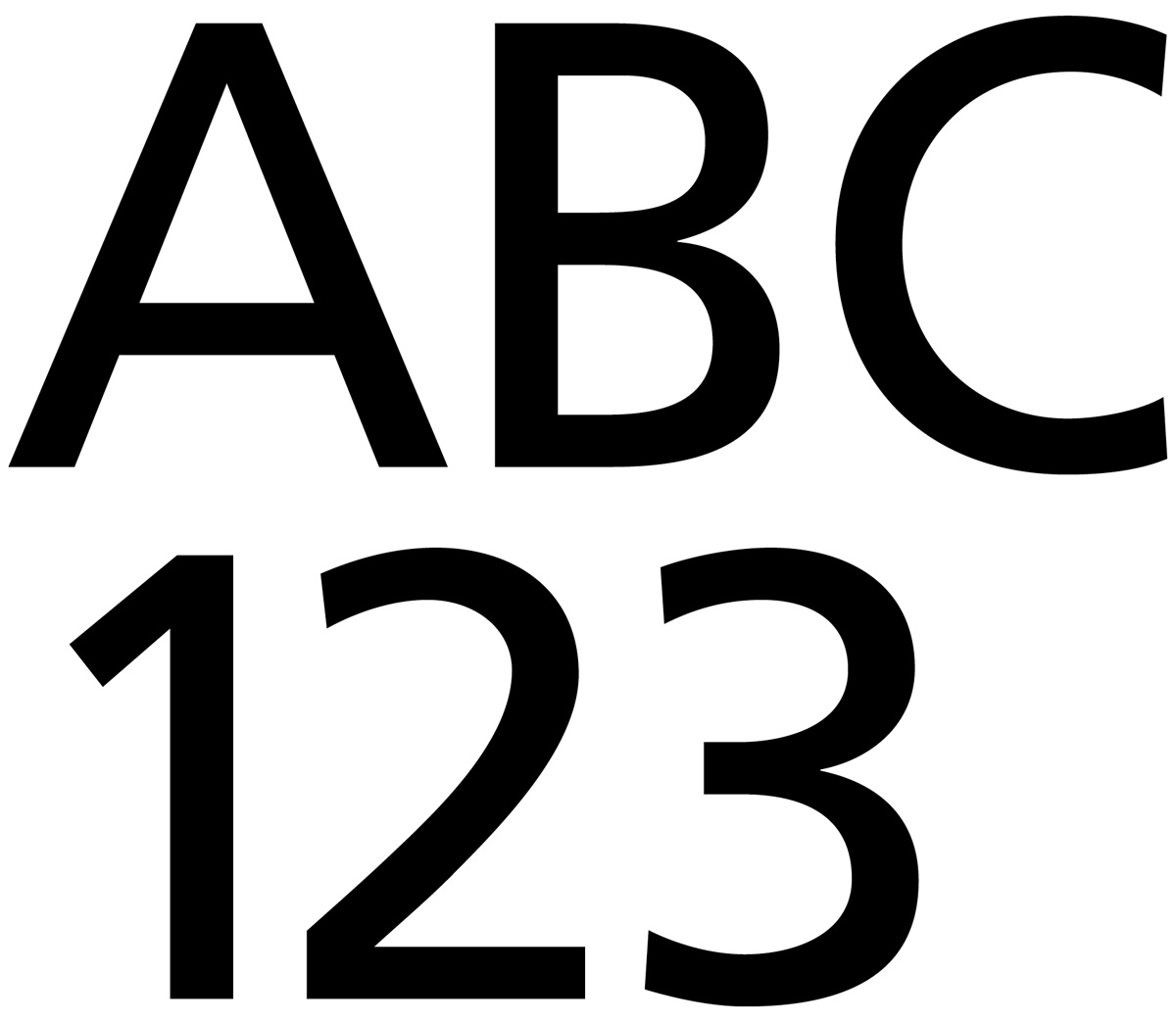
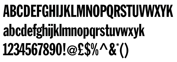
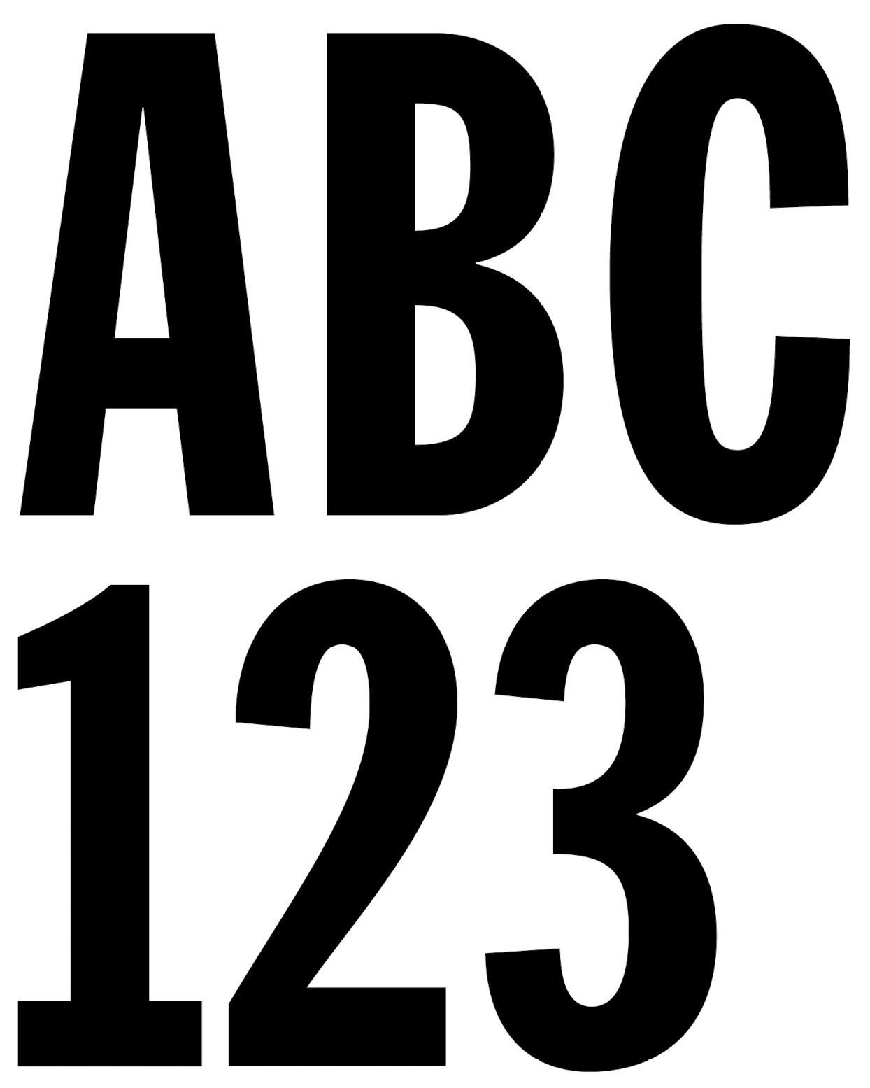
Our secondary typeface is Franklin Gothic Extra Condensed. This is the font used in the Fire Kills logo.
Franklin Gothic Extra Condensed should be used sparingly for main headings, key messages and section dividers. The font can also be used to support Level one illustrations as shown in Section 14.14.
The more we use Franklin Gothic Extra Condensed the less distinctive it will become, which is why we should consider its use carefully.
No other weights are permitted.
Text should never appear smaller
than 16pt.
Illustration
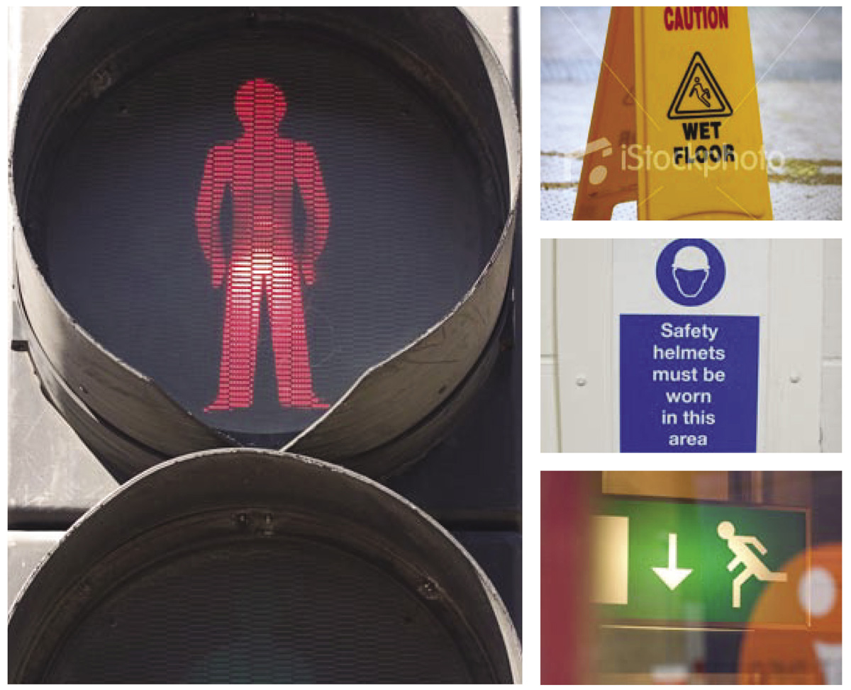
This page shows the inspiration for our style of illustration – the types of signs and safety instructions we are familiar with and see in every day life. The following pages show how that inspiration has been interpreted to develop distinctive style for Fire Kills illustrations.
Level one – key message illustration
We have two levels of illustration.
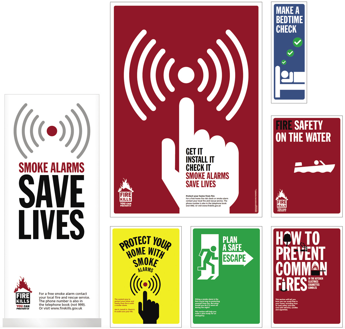
The first style combines short sharp messages with simple illustrations and bold colours – a natural extension of the Fire Kills logo itself. The most important thing to remember is to combine the message with the illustration so that they work together. Combining key messages with visual cues will ensure the information presented is memorable, quickly imparted and easily understood.
This style of illustration should only be used for primary communications such as posters, leaflet covers and section dividers.
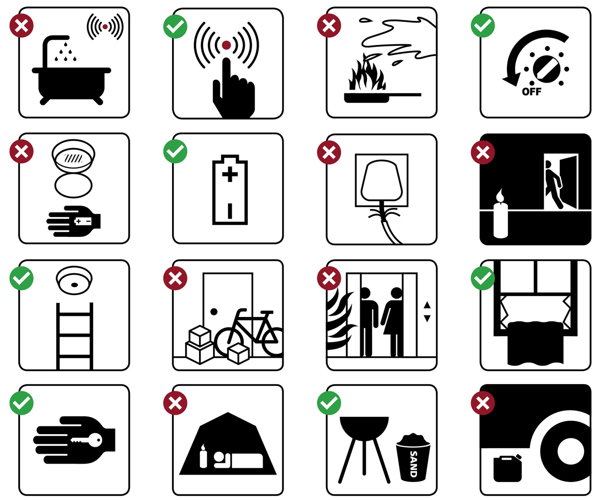
Level two – instructional illustration
Our second style of illustration is used to support the content of materials.
This illustration style consists of clear straightforward instructional graphics.
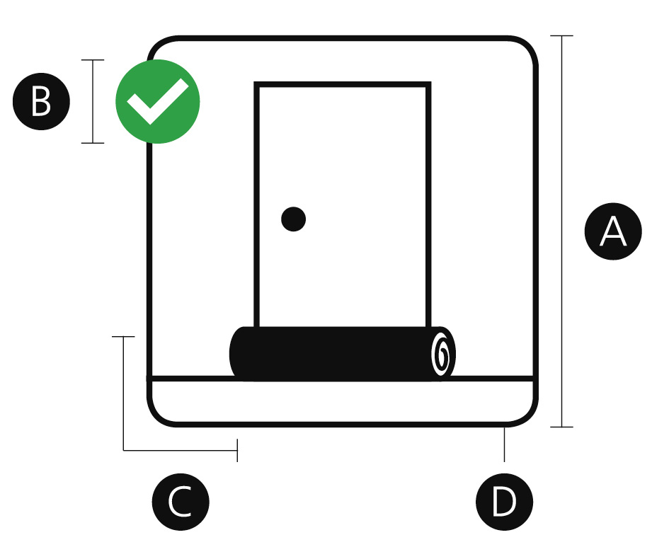
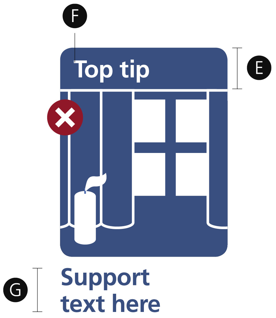
A red circle with a cross is used to signify dangerous behaviour and a tick in a green circle is used to signify positive behaviour.
The trick is to keep the illustrations as simple and as uncomplicated you can.
There should be no room for confusion.

Constructing level two illustrations
Here you can see how to construct level two illustrations. Level two illustrations are contained in a box with curved edges as shown. They are all black and white only, with the exception of illustrations to accompany top tips which appear in white reversed out of a blue box with curved edges.
Page layout and grids
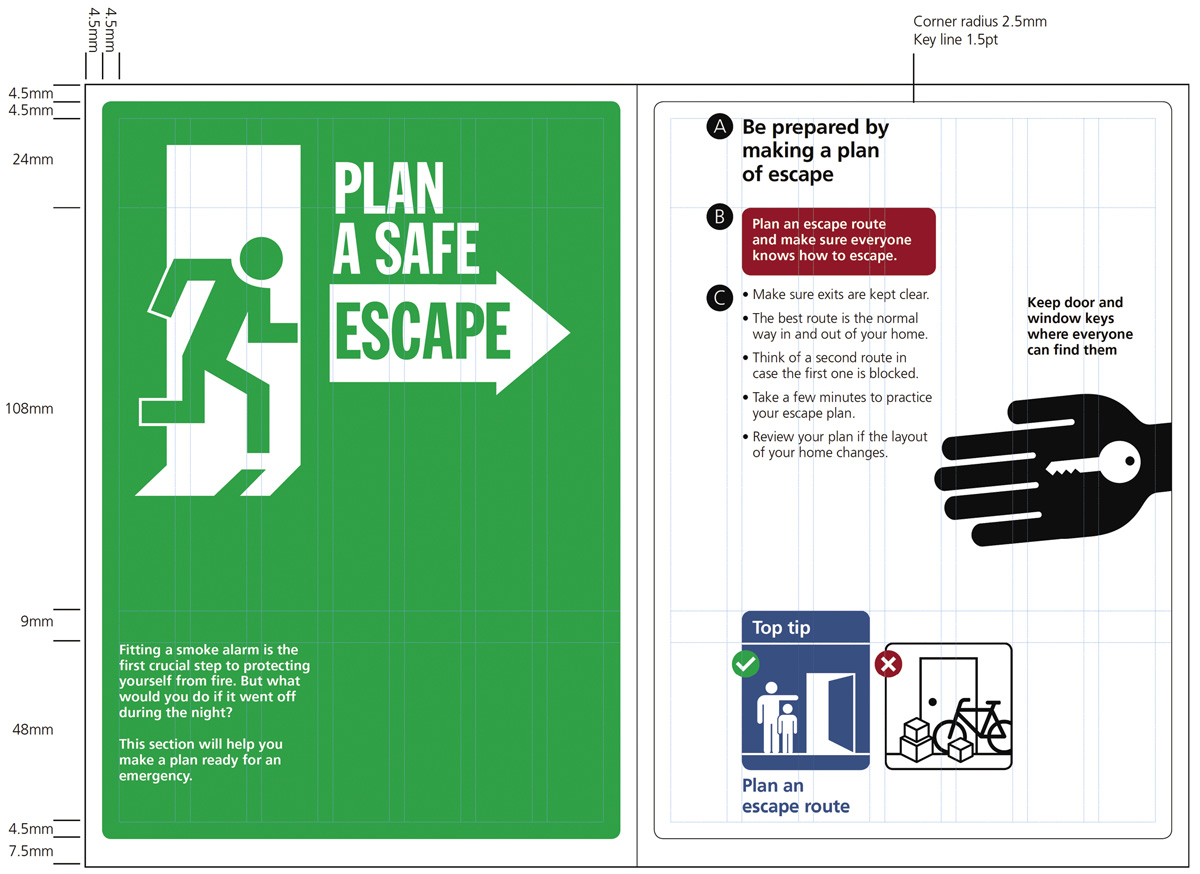
We want to ensure our communications are easy on the eye, crystal clear and uncluttered. That’s why we use a grid system as shown to construct our page layouts. All elements fit within or follow the lines of the grid to ensure order and structure. We also do our best to ensure words and images do not flow into each other which can make materials difficult to read and messy. Keep large sections of text and illustrations separated on the page and allow clear space around them. This will help to ensure a clear, welcome and modern look and feel.
Photography
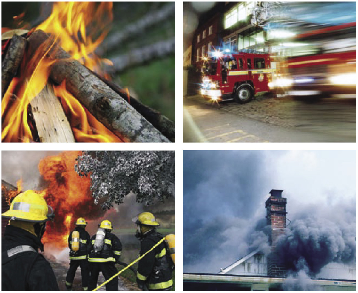
Photography is always used sparingly to support illustrations, which are the focus of our visual identity.
Photography and illustrations should never be used together on the same page, always choose one or the other.
The photography we use should always be realistic and believable adding a sense of action, dynamism and drama.
We avoid showing people, unless they are Firefighers in action, and when this is the case we avoid showing their faces.
The most important thing to ask yourself when choosing a photo is: does it look realistic and believable?
Our tone of voice
Our words are crucial.
They help us get our messages across to protect people from the risk of fire.
Our tone of voice guide is designed to help us use words effectively. It will help us create a consistent style for Fire Kills written communications.
What is tone of voice?
The way we use language will influence how people react to our communications, and whether they take our advice or not.
But it isn’t just what we say that’s important, it’s the way that we say it. People will remember our manner and from this they will judge the value of our communications.
That’s where our tone of voice comes in – it ensures we express our messages in a way that people will connect with.
Tone of voice: Guiding principles
The way we communicate is based on the following guiding principles:
Fair
We need to communicate with a diverse range of audiences. We must therefore avoid any language that could stigmatise.
Take care to avoid language that could alienate, to build bridges not barriers.
Courageous
We believe in being bold, but that doesn’t mean we should use angry, aggressive or threatening language. We use crisp active verbs to express drive and energy.
Supportive
One challenge is to show that we are real people and that we understand people’s experiences, even when they are sad. We are happy to show the lighter side of our personality as long as it doesn’t undermine a serious message. This can be done simply by using a friendly, supportive tone.
Determined
Talk to any of our staff and its there. So how do we get it across? We use strong, robust language and are heartfelt and direct. Rather than shy away we should use simple honest language.
Honest
Everything we say should be grounded in evidence. We don’t over-claim or hype things up. We are always calm, precise and accurate.
Active
Our communications are often designed to provoke action from the reader, like encouraging them to test their smoke alarm. That’s why our language should be upbeat and action orientated.
Positive
We need to deliver serious messages but we don’t want to come across as being overly negative. Too much doom and gloom could disengage readers.
Authoritative
We want our communications to be firm but fair. At times we will need to use words like ‘don’t’ but use them sparingly to preserve their impact. Too many ‘don’ts’ will make us sound bossy.
Everyday words and natural phrases
- Try to use short sentences. If it works to use an elegant long sentence, that’s fine, as long as you use enough punctuation.
- When it comes to grammar we’re happy to push traditional boundaries. Starting a sentence with ‘and’ or ‘but’ can add a friendly, conversational tone.
- We want people to be inspired by our choice of words and what we have to say. Using too many long words and phrases can sound formal and stuffy. That’s why we always use simple everyday language.
Tone of voice: Top tips
Plan your writing
Think about the purpose of your writing before you begin. Work out your key points and structure them logically and clearly.
Keep it active
Use active verbs for energy, pace, conviction and personality.
Use natural words and phrases
Try to avoid formal, bureaucratic language. Find everyday alternatives and use words that your readers will be familiar with.
Talk to the reader as an equal
Avoid lecturing, finger-wagging or patronising. Treat the reader with respect and use a down to earth conversational tone.
Go for shorter sentences
Keep sentences and paragraphs short, straightforward and simple. Keep a sentence to one idea and a theme to a paragraph.
Don’t overdo the adjectives or explanation marks
Take it easy when using adjectives; you do not produce stunningly brilliant, or excitingly innovative writing by throwing together strings of outrageous descriptions. Use exclamation marks sparingly, too many can appear aggressive!!!
Put yourself in the readers’ shoes
Make sure your writing is easy to navigate. Break up your text with headings and signpost important information. Always check your writing before it is published.
Convert jargon
Convert technical language into something that can be more easily understood.
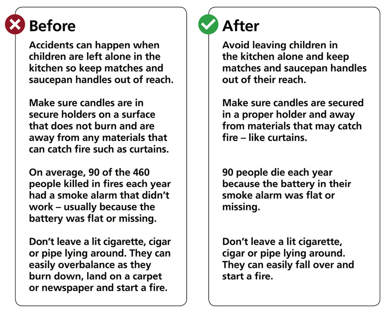
The following examples show how we have improved copy by following our tone of voice principles and top tips.
Resources
Logo artwork, a library of level one and two illustrations from current and future publications, and an A5 grid are available from the Fire Kills marketing team:
New artworks will be available as new leaflets are produced.
7th Floor
Eland House
Bressenden Place
London
SW1E 5DU
T 020 7944 3628
Fire Kills identity guidelines
Published February 2008 by the Department for Communities and Local Government.
©Crown copyright 2008. Printed in the UK on paper comprising no less than 75% post-consumer waste.
Product code FS072
For advice on applying the BSS’s brand and design guidelines, please contact us through our website www.boatsafetyscheme.org or call: 0333 202 1000.
All diagrams, illustrations, and images aren’t to scale and are for illustrative purposes only.
