Illustration
Communication through illustration
Our Illustration styles take two forms.
- Safety communications using the International Standards Organisation (ISO) safety standards.
- Illustration for communicating our brand and publicity.
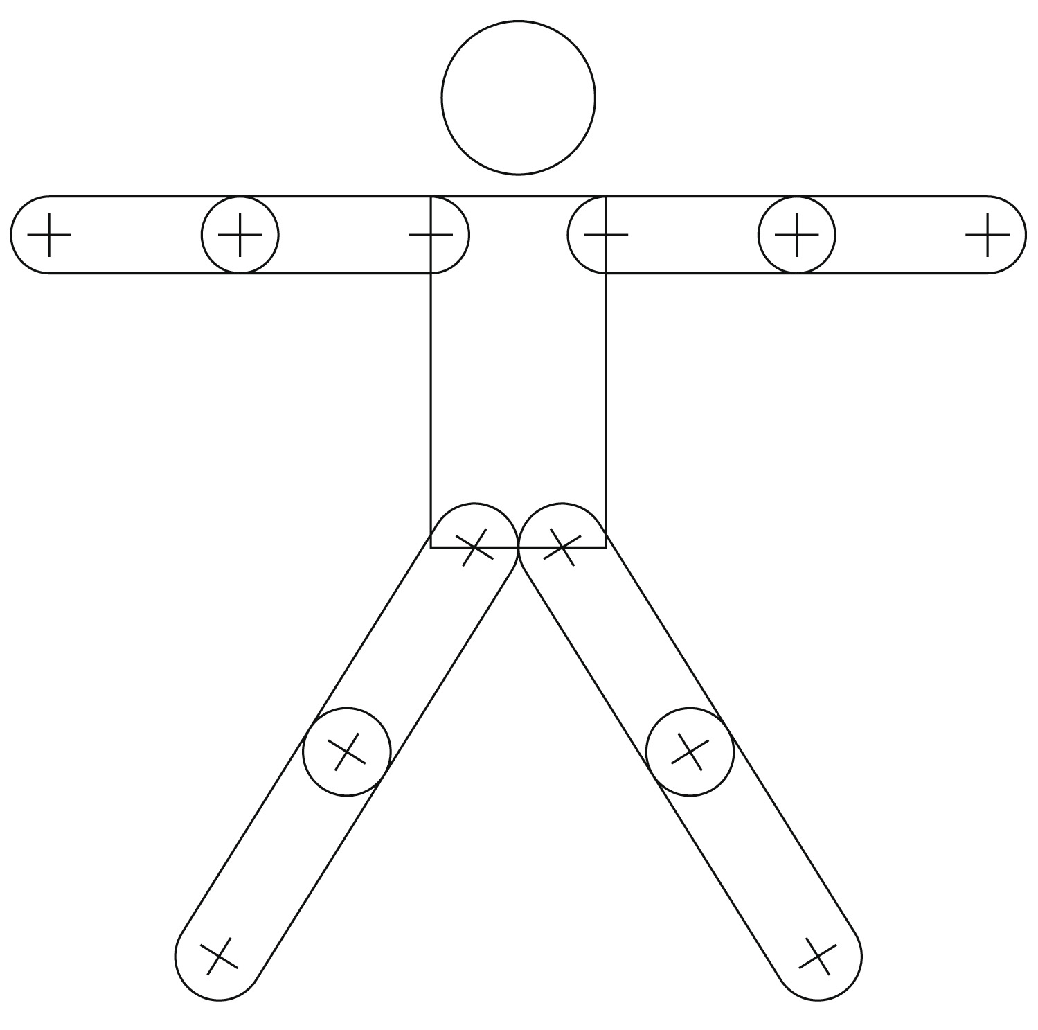
Safety communications using the ISO standards for safety
Form and function
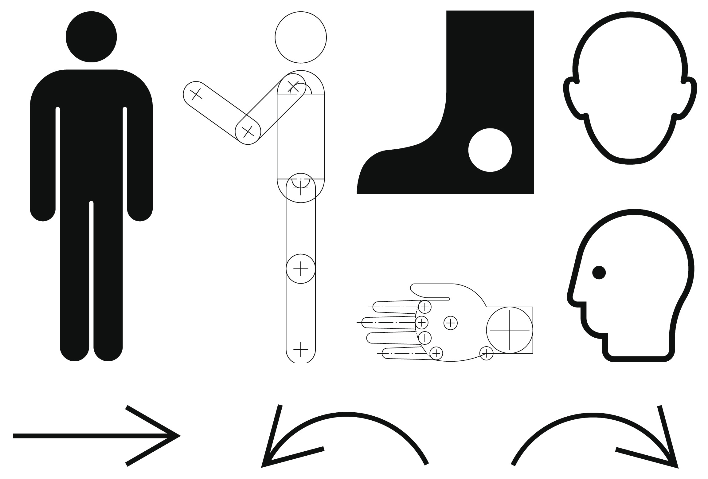
Here are some examples of ISO illustrations used in safety signage.
These simple to create illustrations are universally used and convey simple messaging.
You can find a full set of these when using Registered Safety Signs (ISO 7010) (2021-02-04).
Before creating or supplying any of these types of illustration please contact the BSS through our website www.boatsafetyscheme.org.
ISO 1070 Safety Sign Colours based on ISO 3864
Please follow the colour chart when specifying ISO standard signage print.
These are the colours specified in ISO Standard 3864-4:2011 in RAL colour standard.
Warning
Signal Yellow | Ral 1003
RGB/Hex #F9A800
Safe Condition
Signal Green | Ral 1003
RGB/Hex #237F52
Prohibition / Fire Equipment
Signal Red | Ral 3001
RGB/Hex #9B2423
Backgrounds and Symbol
Signal White | Ral 1003
RGB/Hex #ECECE7
Mandatory
Signal Blue | Ral 5005
RGB/Hex #005387
Symbol
Signal Black | Ral 1003
RGB/Hex #2B2B2C
In addition, ISO standard 3864-2:2016 lays out the following colours that correspond to levels of risk.[4] This standard adds “Orange” as an incremental colour to the palette in Section 3.5.
Low level of risk
Panel background: Yellow
Contrast colour: Black
Definition: RAL 1003 (per ISO 3864-4)
RGB/Hex: #F9A800
Medium level of risk
Panel background: Orange
Contrast colour: Black
Definition: RAL 2010, Munsell, 2,5YR6/14G, or Munsell 5YR6/15G
RGB/Hex: #D05D29
High level of risk
Panel background: Red
Contrast colour: White
Definition: RAL 3001 (per ISO 3864-4)
RGB/Hex: #9B2423
Printed colours will vary from their on-screen digital equivalents and may also be affected by the material they’re printed onto. Where possible use colours as close as you can to the original Pantone specification when utilising the Ral colour system.
Illustration for communicating our brand and publicity.
Illustration plays a small but significant part in our brand.
Our illustrations may be used as an alternative to photography and to bring technical accuracy to our communications.
Our illustration style has a bold, fluid form whilst using simple shapes to create effective messaging.
Keeping things simple removes ambiguity so we’ve created the following simple instructions:
- Keep it simple.
- Don’t use animals unless necessary.
- Only use simple shapes for structures.
- You must always use our colour palette.
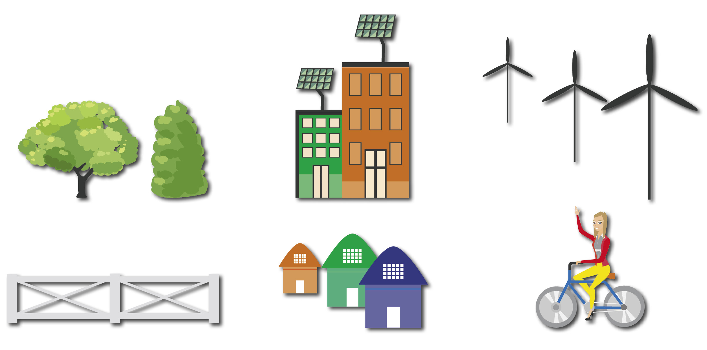
Objects
The fewer the objects the better and they must be determined by the content of the message.
You can use tints to add subtle details and to broaden the range of colour across all illustration.
Shadow detailing uses the same colour multiplied on top. Adjusting the opacity changes the shadow strength.
Any new illustrations created must be approved by the BSS.
For further details you can contact us through our website
www.boatsafetyscheme.org.
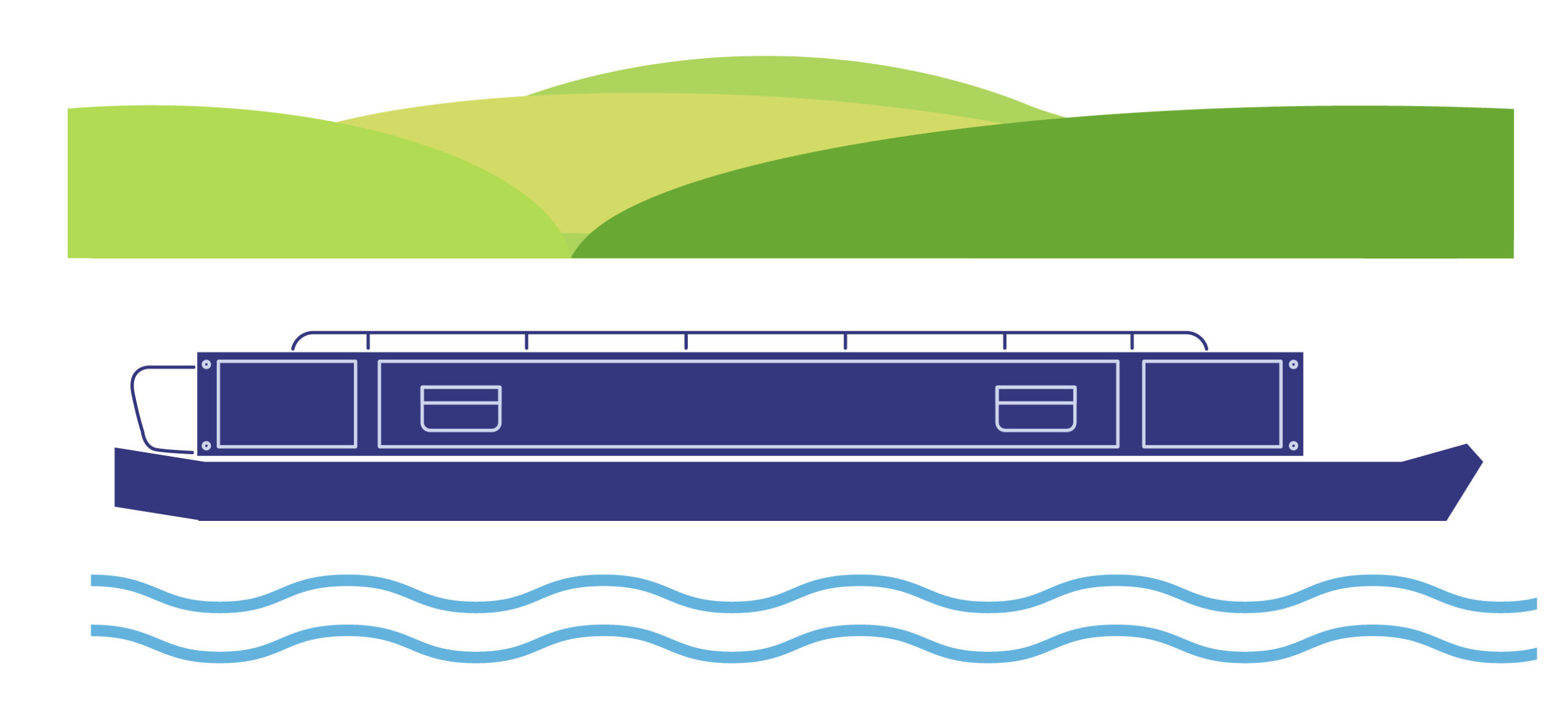
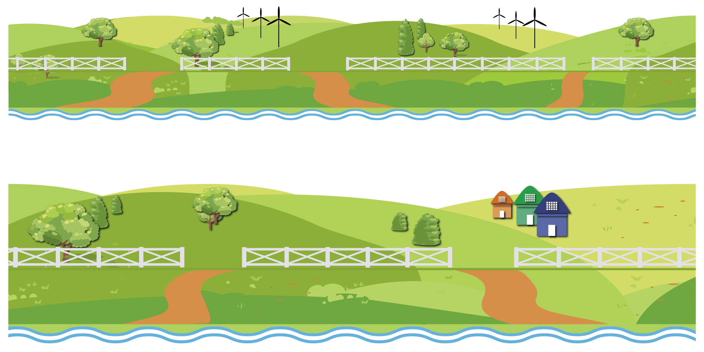
Panoramic scenes
You can use panoramic scenes to tell stories through simple images, more complicated whiteboard video and infographics.
You must tailor the scene to fit the required format.
You can adapt panoramic scenes to give a different meaning based on the story they’re telling.
They may use a combination of linear and solid shapes, ensuring the focus of the illustration is always in the foreground.
For advice on applying the BSS’s brand and design guidelines, please contact us through our website www.boatsafetyscheme.org or call: 0333 202 1000.
All diagrams, illustrations, and images aren’t to scale and are for illustrative purposes only.
