Typography
Overview
Typography is an important aspect of our brand identity.
Our typographic style contributes to our distinctive aesthetic.
Our typographic palette helps tie all our communications together – creating brand consistency and memorability.
Typography represents the tone and values of our brand – just as colour represents a feeling or visually conveys a message for all our stakeholders. Every category of the font has a different meaning and thus portrays a different representation of our brand and what our organisation stands for.
You should follow the typography usage example on the following pages to ensure all our communications remain professional, consistent, legible, and memorable.
Our typefaces
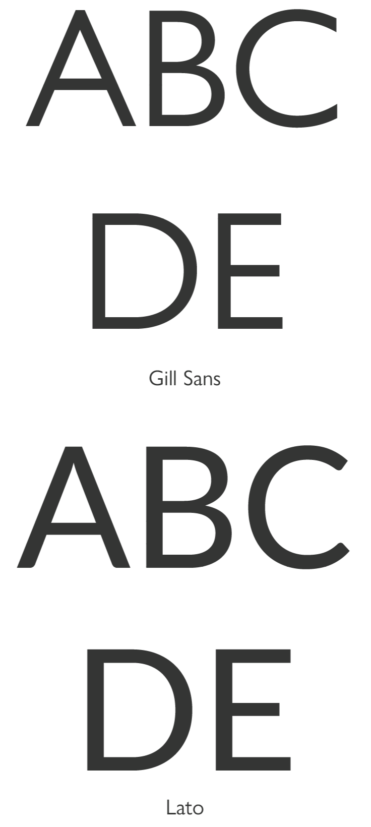
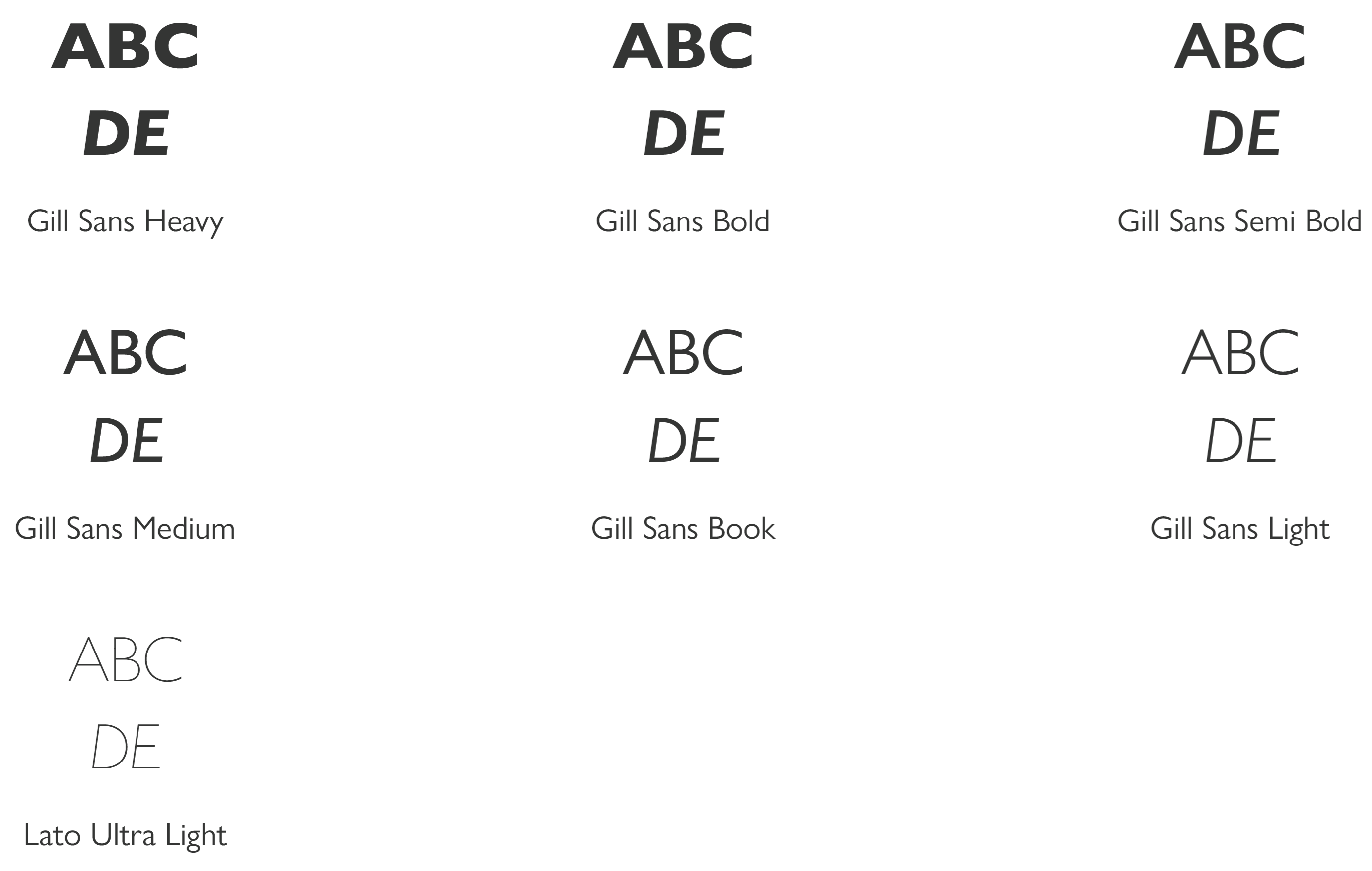
We use a brand typeface called Gill Sans – a friendly sans serif typeface available in a range of different weights and italic versions. We only use it in the following forms:
- Bold.
- Semi Bold.
- Regular / Book.
- Light.
- Respective Italics.
Gill Sans is extremely versatile – we use it for everything, from headlines to body text, from our outdoor signage to our internal reports and in print too. Wherever possible we try not to use italics. This ensures we have a consistent look and feel across all our communications.
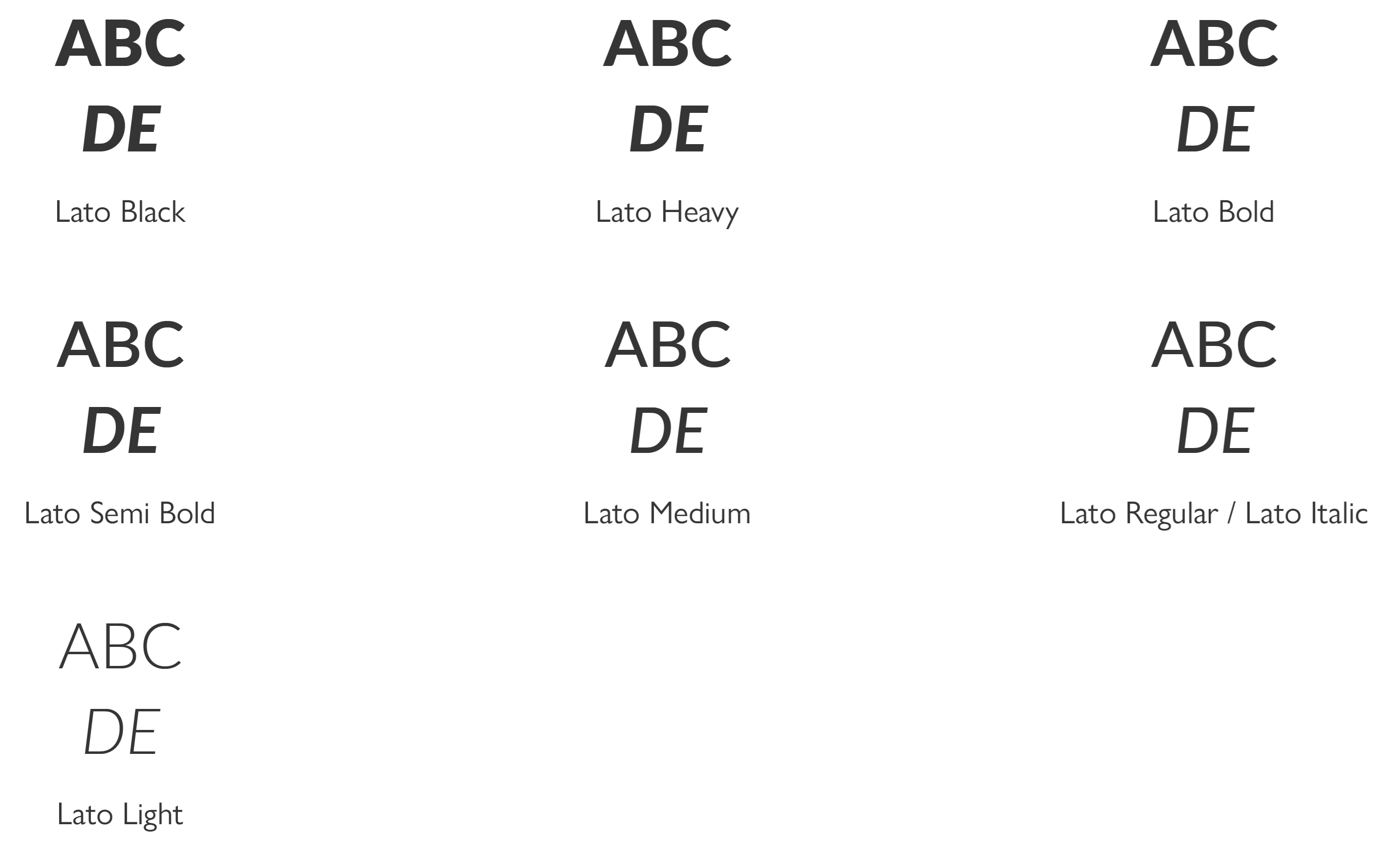
Lato is our substitute font for when Gill Sans can’t be used for instance on our website. We only use it in the following forms:
- Black.
- Heavy.
- Bold.
- Semi Bold.
- Medium.
- Regular.
- Italic.
- Light.
- Ultra Light.

Gill Sans
Our font of choice is easy to read and good on the eye. It’s versatile and has a large family of fonts to choose from.
The standard recommended font size for use is 11.5pt with 15.5pt leading / line spacing.
You should use no more than four font sizes per communication. We understand you can use fonts extremely creatively across a brand, so we include seven font weights to choose from.
We want our designs to be as creative as possible.
Wherever possible don’t horizontal scale fonts or use excessive tracking.
When using larger fonts then increase font and leading proportionally. Ensure the type is legible at all times – see Section 8.0 Print for examples of layout and design.

Lato
Lato is very close in form and range and complements Gill Sans in most ways. It has a large family of fonts and again is stylish and easy on the eye.
The standard recommended font size for use is 11.5pt with 15.5pt leading / line spacing.
When using larger fonts then increase font and leading proportionally. Ensure the type is legible at all times – see Section 8.0 Print for examples of layout and design.

Alignment and weights
Our typographic style is modern, clean, and friendly. The grid, colours, and typeface all create clear and welcoming communications.
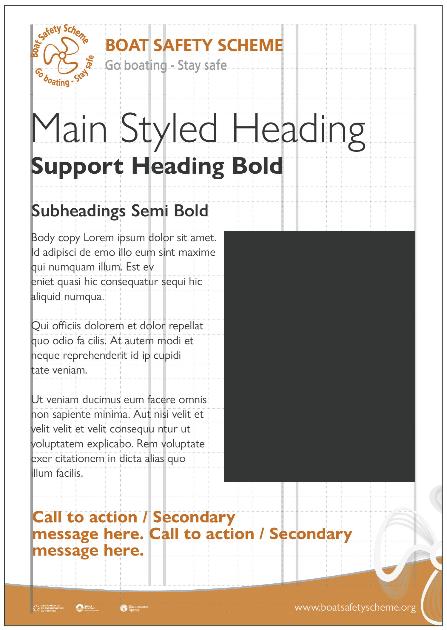
You can use colour, size, or weight to create stand out communications. However, you should keep these to a minimum and restrict them to around four sizes of text where possible, in a maximum of four weights.
Text should almost always be left aligned, with headings, call to actions, and key messages in bold or light, and supporting body text in Book.
You should keep other versions of the font usage to a minimum.
Consider the text arrangement, line spacing, and letter spacing carefully
Never justify text, as it creates messy gaps between words and reduces readability.

For advice on applying the BSS’s brand and design guidelines, please contact us through our website www.boatsafetyscheme.org or call: 0333 202 1000.
All diagrams, illustrations, and images aren’t to scale and are for illustrative purposes only.
